MS Office Professional Plus 2007
Installation was the simplest of all things. The first point of order you will notice is that the progress bar is not a liar unlike the previous version cheating on multiple runs. The welcome change is that you don’t have individual boxes for the product key. Just one long box for the entire thing.
As obvious the installation looks like simply like a page from the Mac’s Big book of GUI. Just a progress bar and the name of the product. On a large page with a simple background design.
Microsoft Word 2007
As obvious the interface has gone under a major facelift from anything I can relate to from the previous office products. The first thing that strikes me Is that the interface, I have seen it somewhere. Yep got it. It’s strikingly similar to the design in Microsoft’s Kids Software Interface with all the cool tools like Talk It and so on. That was a part of the Microsoft Plus Toolkit of the ever famous windows 98
Looks terribly blue. A major feature of the sliding bar for the zoom looks like a direct rip off from the Google’s Picasa Software. The Buttons are arranged logically. That is Clipboard, Font , Paragraph , Styles And Editing Sections.
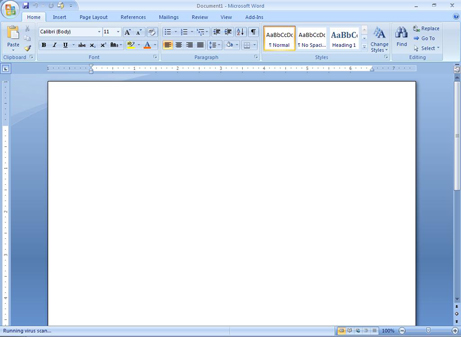
Should say a terrible loss for those folks who are looking for the standard windows API that made it ever famous. Yeah I am talking about the File Edit Insert etc kind of menus. None of them exist anymore. Should say the main aim of windows was to give a common look and feel. Now I can safely say. Its time to relearn or reconsider.
Mouse over highlights has got a delay in fading. Looks like we are playing a light up keyboard. Anyways instead of menus this has got tabs. Tabs of stuff that we would like do. The plug-ins has got a special section. So it’s way too easy to find them.
Whatever happened to times new roman. Font.. The new default font is called Calibri (body) , looks like a makeover of Tahoma and Verdana.
Many features have been added like digital signatures. More support for file versioning and so on. A most welcome change is that the direct support for PDF document creation. I still don’t see the ODF hyped stuff these people talk about. So I guess I’ll wrap up Word Here. And review the rest.
Microsoft PowerPoint 2007
Interface looks exactly similar to that of the word. Sheesh I sure did wish that it would be having an orange color scheme was like word logo blue. PowerPoint logo orange. That way. The most welcome change that I can say about PowerPoint is the themes. They got fewer themes and some of them looks cool. But really it’s nowhere near the Apple KeyNote. Wow that thing can deliver a keynote by itself. The theme I liked best (Civic) is really simple and neat. Another feature of this is mouse over preview of themes or options. It’s a great feature for all those running a dual core Intel D or an AMD x2 , but what about us poor folks it sometimes tends to be a disadvantage on the longer run.
Animations tend to be better understood with this version of PowerPoint as they are described as wipe from above. Instead they give a nice little diagram about what could happen with all arrows. And so on. But to tell the truth the blue is slightly getting on my nerves. Although I am a blue color freak, is getting a bit too annoying.
Another nice feature I found about PowerPoint is the new one in which one can have the presentation view. That is you can see how exactly the show will go on. Lucky me I could test out this feature and how it runs because I had my new Sony HDTV hooked onto my PC.
One can save the PowerPoint presentation as pdf. List like those Linux freaks do, it’s really cool to do it in windows. Another rip off from KeyNote is that the charts and diagrams have got textures that was a stunning feature of the Apple Software, The implementation is Nice but not as cool as one in KeyNote.

Finally, to speak of a common feature is the mark as final, as I consider myself as one of the lazy retard folks who can’t keep tag of where the final version of the file is. The office provides a MARK as FINAL option. But again. This has to be extensively tested against marking so many different files as the final. I guess a simple time stamp of when it was saved would save me the trouble of opening it and checking everything. Like I do with the previous versions.
Microsoft Excel 2007
As obvious as it is this devil also denies you to float around with toolboxes. All are fixed and they are on top. Just as adamant as Henry Ford was on Ford comes in all colors that are black. But that seems intelligible thing to do because after a while of using the office suite you will have to reset the tool boxes to the default location as the suite tends to look more or less like your very own desk. Cluttered and messy. Mouse wheel can move you through the tabs or ex-‘toolboxes’.
The first thing I noticed about this ever popular accounting / spreadsheet application is that the new sheet is as simple as a click away. Before one had to go click insert new sheet or right click new sheet option. But there seems to be a tiny button to do that daunting task for you. Although rename takes double clicking, it’s a welcome change from clicking exactly on the text saying “sheet 1” as in the prior variants.

I always have this question as how different colors are shaded based on the values in the boxes. I did ask few of my teachers at college about and they were like “oh yeah it does that?” attitude. Ah that makes me understand that they work on a template that is designed my someone else to enter our marks. But this version simplifies that task by an option called Conditional Formatting. You can color grade your values. So I guess I can see top students mark go green, bottom guys go red, but I still remain yellow. However that can’t change I guess.
Another Awesome feature about this is the Format as table option. I always wanted to format stuff like the calendar colors that word offers. But this thing helps you to do that automatically. Loads of preset ‘cell styles’ are offered that helps you pep up your numbers. As always the great leader Microsoft Taught us, or at least is helping us Make Numbers Fun with Colors.
The graphs have got a major make over in color. Yeah its cool to look at graphs with various colors rather than the obvious red blue green yellow combination. But shades of colour.
Conclusion
This is just a simple review by an engineering grad student at the way he uses office. So its a review of the major tools that i use. So to simply put it: this is just another upgrade, no major makeover other than the GUI, and some features here and there. The Claims are high the stakes are high, But the frank point is that I have never been as impressed by this major software company since Windows 2000. I really got freaky happy at the release of the Windows 2000 on 17 February 2000.
All I can see around Office 2007 is major Hype. And Of course the controversy of the ODF formats. But as long as the Beta is free, I’ll keep it.
Adios Buddies - Do Comment - Took lots of pain to write em
No comments:
Post a Comment